Mobile UX/UI, Design System
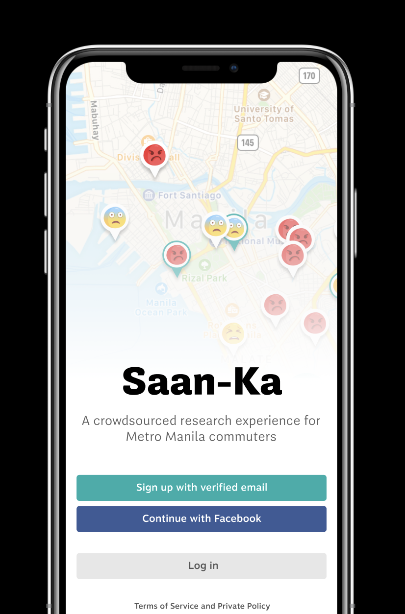
Saan Ka: Capturing the Stories of Metro Manila Commuters
In one of the most densest metropolitan areas in the world, Manilla commuters are forced to travel in capacity-exceeded, dangerous modes of transportation.
As a client project for the Anthropology department at Carnegie Mellon University, Saan Ka eases the process of collecting logistical and emotional data about commuters in Manila. With the often angry commentary on the commuting experience being ignored by privileged policy-makers and government officials, this app seeks to amplify the voices of those most affected
with Ari Daly, Isadora Krsek, Junwoo Cheong, and Julie Choi.
We worked with Carnegie Mellon researchers for 12 weeks to design a mobile app that documents stories of the Manila traffic crisis. I contributed to the app's research process, localization, design system, and UX.
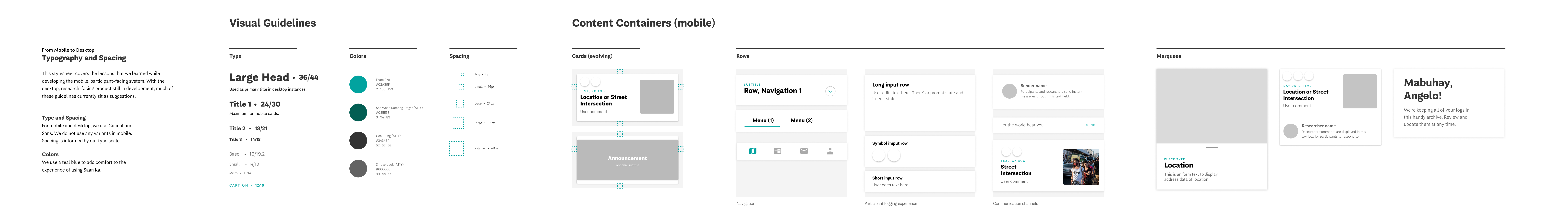
Saan Ka was always intended to be a system of applications for our stakeholders. In building a visual language for mobile, I led efforts in preparing guidelines for how it could be translated to desktop.
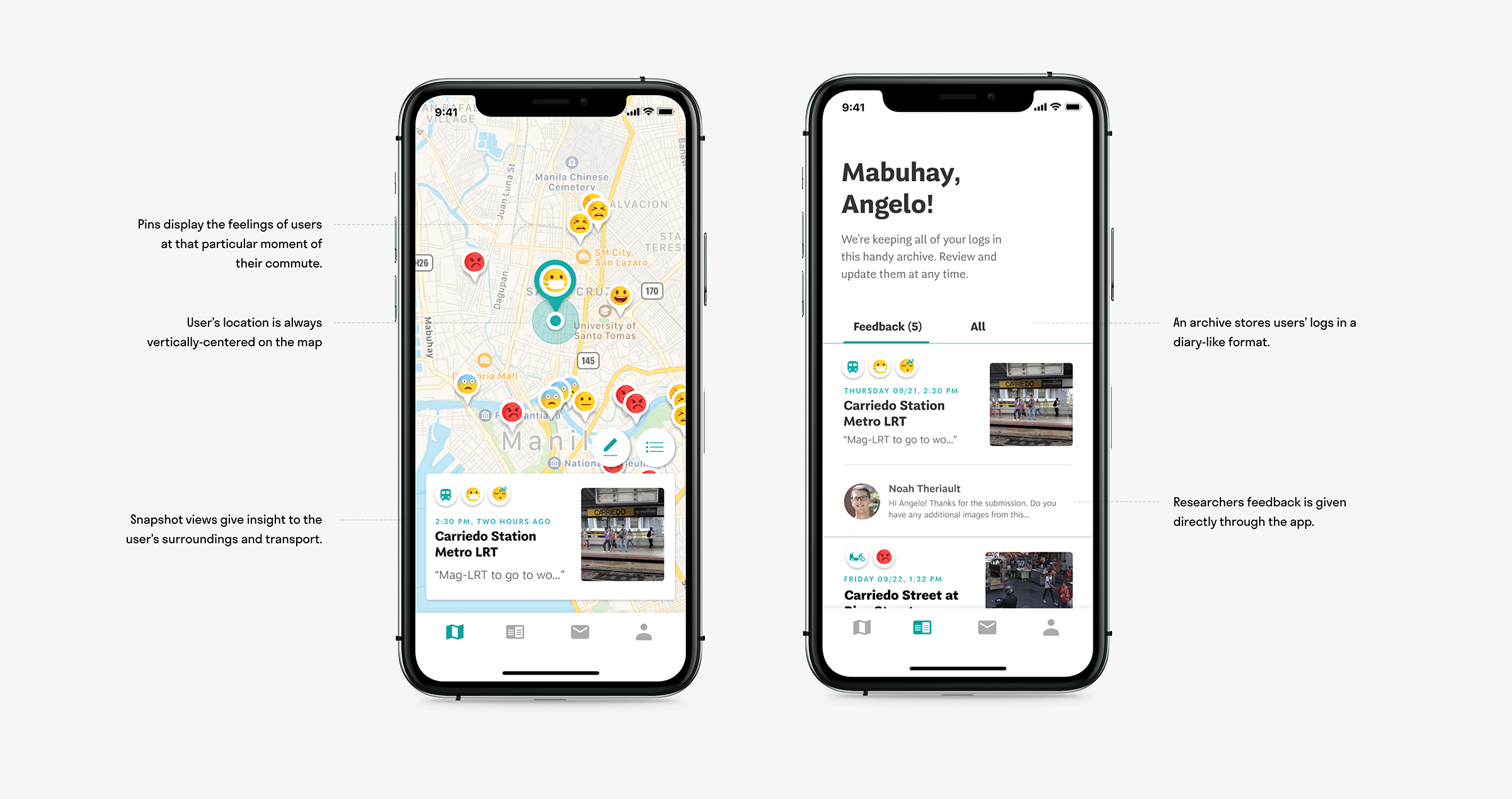
Understanding the circumstances of our user base was an important first step. Through our conversations, we realized that Saan Ka needed to revolve around the life of our users—not the other way around.
The Busiest Metro
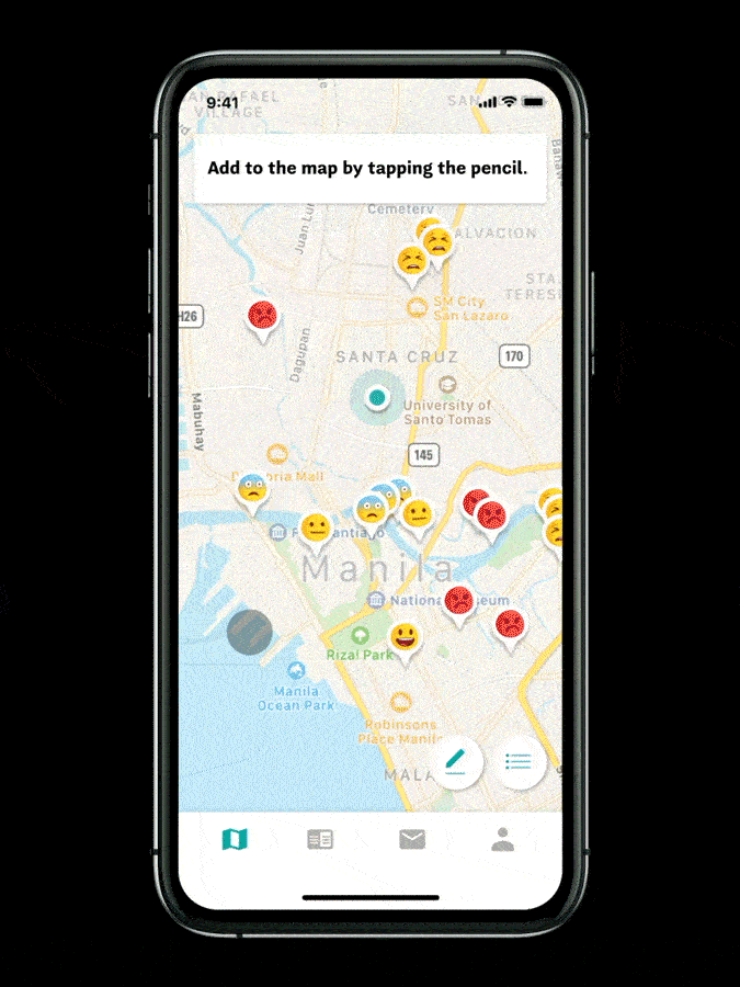
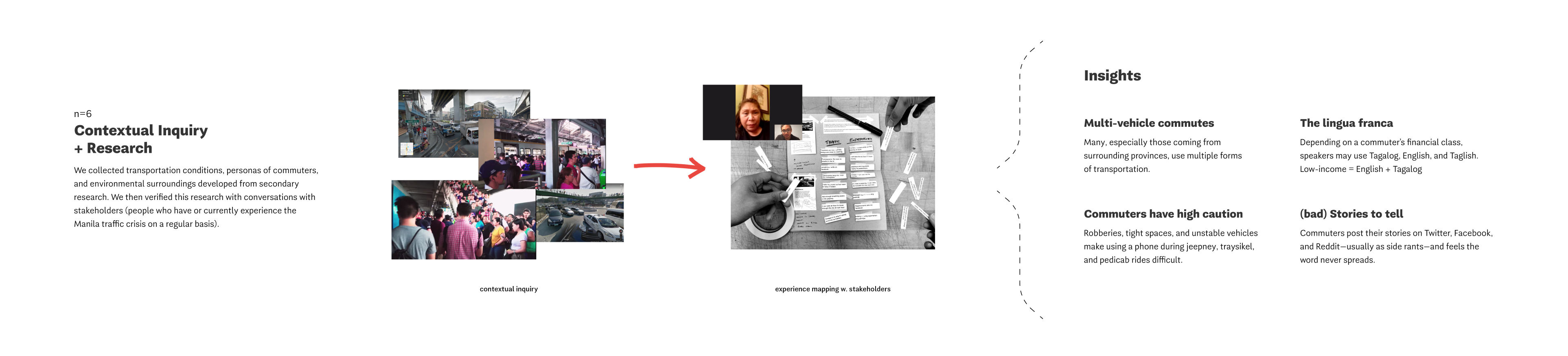
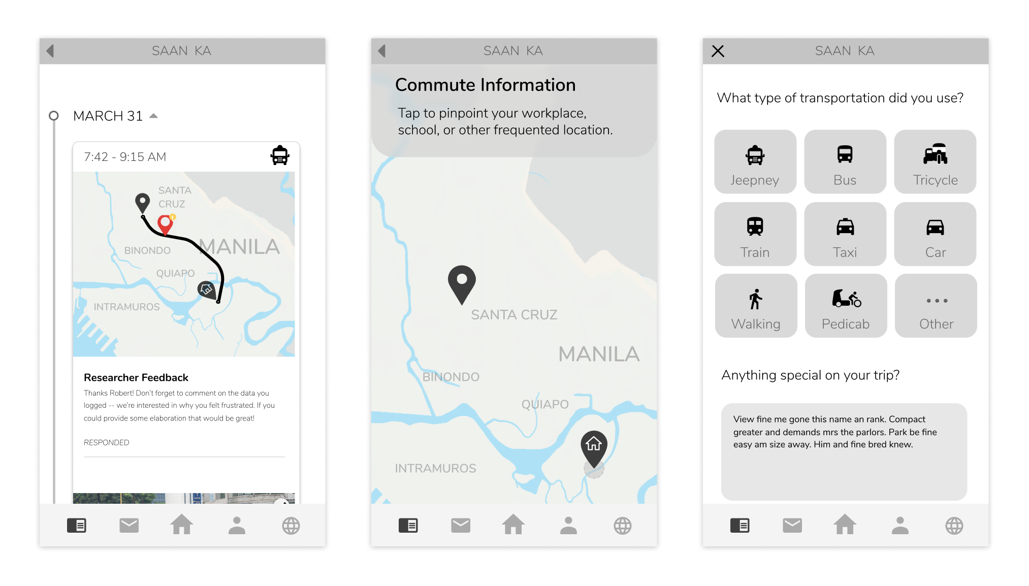
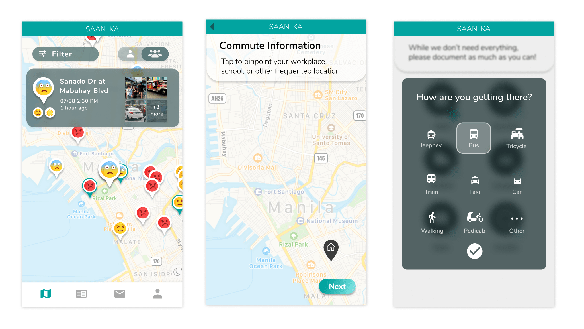
We asked folks who live in Metro Manila about their current experiences. When did they have to get up in the morning? What do they go to work for? What modes of transportation did they take, and at what points?
We championed these experiences in the design of our initial prototypes. If they wrote a lengthy rant about their commutes on social media platforms before, then we looked to develop a similar typing experience. If they only took out their phones in safe areas, then we assumed we shouldn’t send push notifications during specific stretches in their commute.
In their giving of data and time, it was important that Saan Ka’s users were as just as much on the receiving end as researchers were. As we brainstormed the UX, we asked ourselves “how could interactions with Saan Ka lead to a better commuting experience in Manila?”
A Data-Driven Story
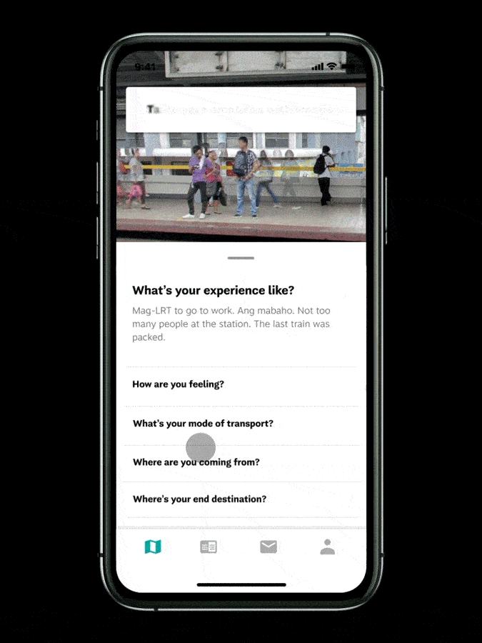
For our researchers, it wouldn’t be enough to know what kinds of transportation participants are using. While purely quantitative data-collection methods exist, that isn’t how actual lived experiences work.
We came up with a handful of features—some incentive-based. But at the end of the day, our conversations with our stakeholders led us to realize that traffic data is wholly beneficial to have in a back pocket.
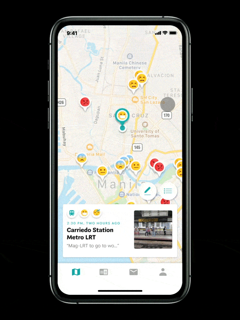
Testing made us aware of the vast conditions that Saan Ka could be used, from frustrating times like sitting in a bumpy cramped jeepney to satisfying moments where the app’s data could be shared to others on the bus.
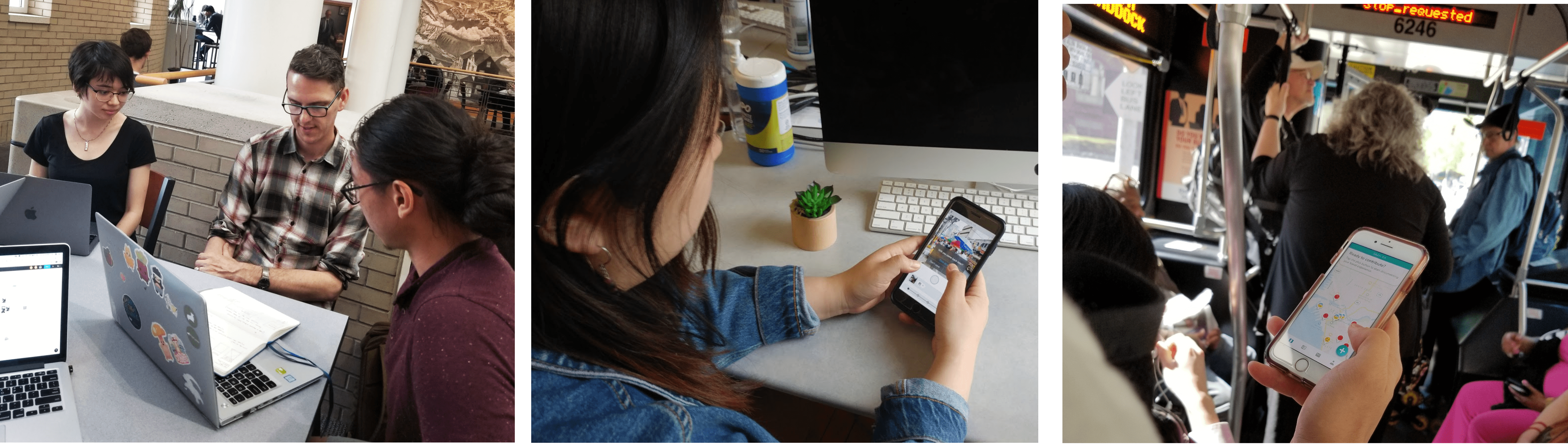
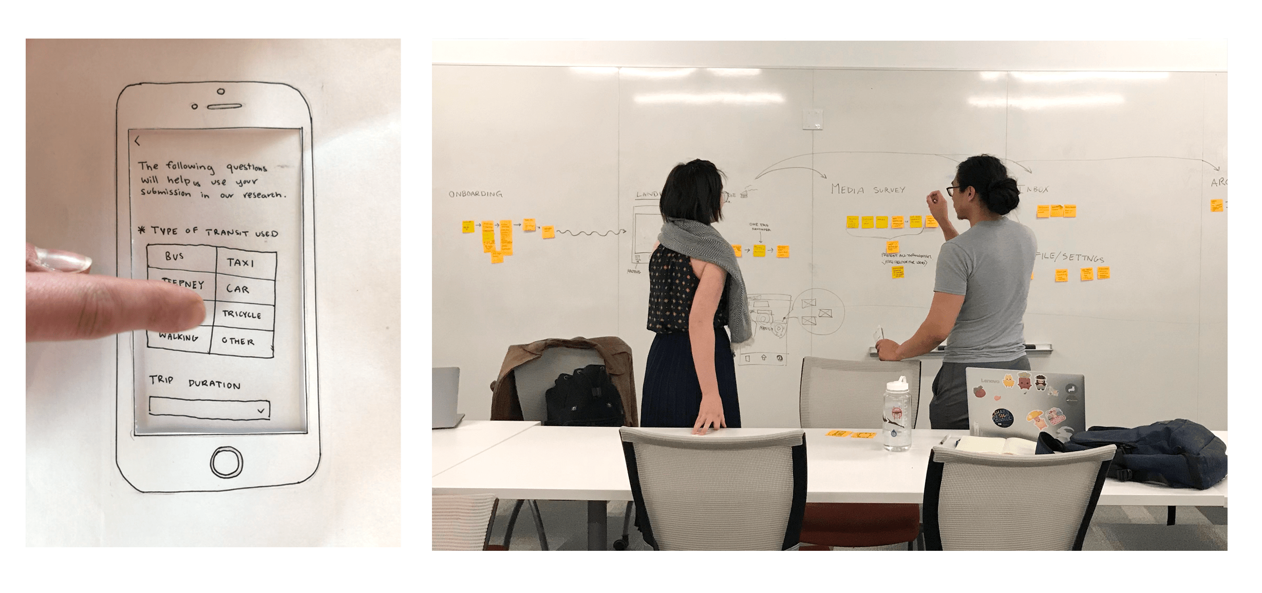
Testing Here, Testing There
For us, that meant thinking about what it might be like to read screens while in cramped, moving spaces. It also meant recognizing the dynamic levels of ability our users might have, from their vision to their ability to tap or type.
From our rounds of local and international testing, we realized we needed to make some visual design adjustments. Type sizes, for example, needed to increase to account for the shakiness of vehicles. Similarly, buttons needed to be expanded for easier tap access.